The other night, my partner and I wanted to make a purchase from Laura Ashley's online store. We'd chosen the items that we wanted and then began the process of checking out.
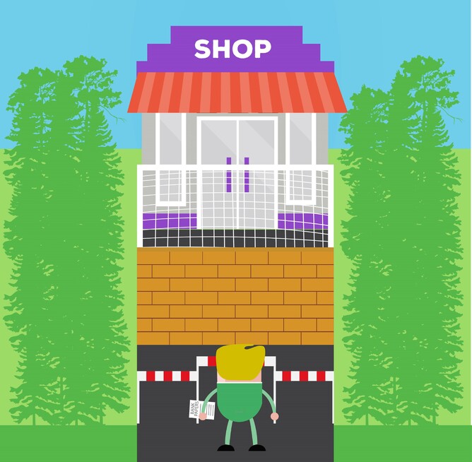
Up until that point the shopping process had been fine. But then we hit the barrier – our email address had already been used to set up an account and we wouldn't be allowed to continue until we'd entered our password. Needless to say, neither of us could remember the password so after several failed attempts we decided to use another email address. This went on until we'd used up our four email addresses so the only option was to reset our password.
After this delay of about 10-15 minutes, we finally parted with our money. If I'm honest, if the Sale wasn't ending that night, it would have been very likely that we would have given up all together or at the very least, decided to try another night by which we may have made a purchase elsewhere.
This experience reminded me of an article that I'd read a few years ago, by User Interface Engineering entitled "The $300 million button". It's clear that by the vast value of this button that this experiment wasn't undertaken on a small online shop, however this was the amount that they concluded that this simple request for customers to sign in actually costed their client per year in lost sales.
The idea is that we, the business owner, ask for our customers to create an online account to make their second purchase faster. After all, this way we can securely save their details which, when accessed, will populate the checkout forms automatically, speeding up and therefore improving their purchasing experience. Plus it means that we capture their details for marketing purposes – everyone is a winner.
However, it was discovered during this particular experiment that 45% of customers had multiple accounts (so like my partner and I, they had used another email address when their first attempt failed). Out of all of the people trying to log in 40% requested a password reset, only 25% of these actually reset their password and fewer than 20% completed the purchase.
So how did they rectify this problem? Now when you get to the checkout you now have the option to log in or you can press "continue" and go straight to the payment page. This simple change increased sales by nearly 45% a month.
When you think about online shopping, do you spend more in shops that have an easy checkout experience? Amazon being an obvious one. Being a parent, I know that Mothercare have the two button option. Equally as someone who does a lot of online shopping, I also don't like not having a paypal option as sometimes having to get up and find my debit card is too much effort!
So if you have an online shop, it may be worth reviewing the purchasing experience and looking at where you lose customers. Do people abandon their baskets or request a password reset but then fail to complete the purchase?
Are you asking your customers to enter into a relationship with you, when all they want to do is buy something?
And if you wondering, in this experiment they gave people the option to set up an account after they had made a purchase and a very high percentage did. So emails were still collected for marketing. Finally, everyone is a winner.
